Website accessibility nowadays has come a long way, but one of the most overlooked things I see daily is the use of colour. I suffer from a mild form of deuteranomaly (reds and greens), and whilst most people would consider this a bad thing to suffer from considering the field I work in, it’s actually a benefit as it helps pick up on colour issues in the design or the UI.
Why Should You Be Bothered?
Worldwide 8% of men and 0.6% of women suffer from a form of colour blindness, and these figures rise in certain countries. In Scandinavia for example, 10-11% of men suffer from colour blindness, which is a lot of visitors you could be losing due to the accessibility and colour of your design. In fact, people might not even know that they are colour blind.
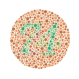
If you see nothing or the number 21 in the image above then you have a form of deuteranomaly. If you see the number 74 then you can see the normal range of colours. If you want to investigate more, here is a quick and free online test.
The usual misconception about colour blindness is that you simply see in black and white. This is known as monochromacy and it’s very rare. The most prevalent form of colour blindness is deuteranomaly, with tritanomaly (blues and yellows) being less common.
Below is a short video explaining the causes and issues related to colour blindness.
Things to Avoid
One of the main design issues I see is the use of colour for identifying something, particularly a category or section of a website. If you decide to use this method then I highly advise using some icons alongside them so that people can associate it with something else other than just the colour.
Remember the day when all text links were blue and underlined? Today I see a lot of non-underlined links with a very low contrast compared to the body font colour. Sure, you put an underlined hover state on it, but this is redundant if the person can’t see the link in the first place. Always try to underline your text links and use a high contrast colour.
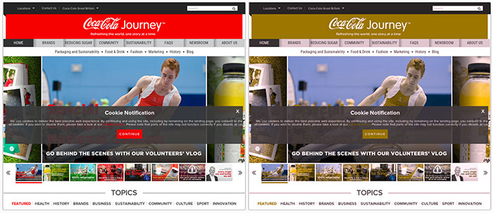
Don’t rely on colour to express something. The image above (generated with Colorblind Web Page Filter) shows how somebody with red green colour blindness can see the colours on a website. This might not work too well if you are using similar shades of colour, and think about your error messages!
So How Can You Improve Your Designs to Cater for These Issues?
Making a website colour blind-friendly does not mean that you should avoid using the colours associated with these forms of colour blindness. There are many tools that can help you with accessibility during the design and development stage.
Stark
If you use Sketch then this is a great tool for seeing the effects to your designs on the fly.
Color Oracle
This applies a full-screen colour filter independent of any applications, which means that you can design in real-time and see how it is affected.
Color Scheme Designer
This is good for checking complimentary colours and viewing how they will be seen by colour blind people. Simply select your colour ranges and use the Colorblind drop-down.
Image Color Blind Simulator
This is great for emulating how a design will be seen by people with various forms of colour blindness. This is probably most useful for checking logos or call-to-action type designs.
Colorblind Web Page Filter
This is great for comparing a built page URL against various forms of colour blindness. It’s a bit slow on the initial fetch and filter, but after that, it’s reasonably fast.
Color Contrast Checker
If you use a compiler during development, this can be installed via npm and will run every time you compile. A warning will appear in your console if anything does not meet the standards. This can be handy if you set up your styles first and missed something during design, the usual culprit being the hover states.
Conclusion
So as you can see, there are many tools out there to help with your website accessibility and colour, with a lot of them able to be used unobtrusively as you work. If you work within a team, then I would advise that the colours have already been through the test process before it gets to development as it could cause some headaches later.